I love where we live! I love our old house & I love our beautiful wild lane on the mountain but most of all I love our neighbours! Over the last 3 years they have become more than neighbours to us, they are as close as family. So when I saw the adorable Crate paper houses patterned paper…I knew exactly what I wanted to capture on this layout. Admittedly it was a difficult page design to pull off, & I ended up fiddling & pushing things around a lot more than I usual do. Having so many specific things I wanted to add to it, made finding perfect tension between those elements challenging.
Join me & I’ll show you what I did.
Big Happy Village by Kim Watson
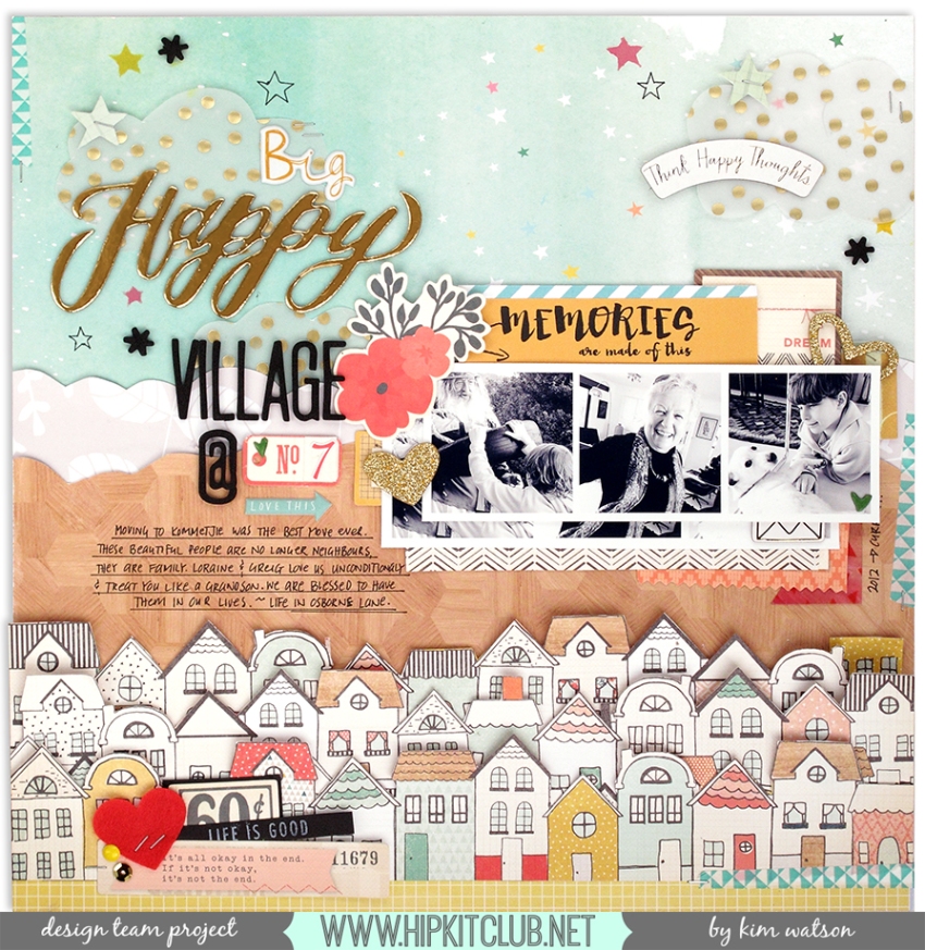 Grabbing supplies from the Main August kit, the Project Life kit, the Paper add-on kit, theEmbellishment kit, & the Color Kit…I started by fussy cutting some rows of houses from the Crate Paper: Cheerful paper. The left over piece of paper, I flipped over, cleaned up the cut edge into loose scallops & used the woodgrain as the next layer. Next came a strip of Botanical Sparkle from Pink Fresh Studio, I finished off with an aqua sparkly sky from Pink Fresh.
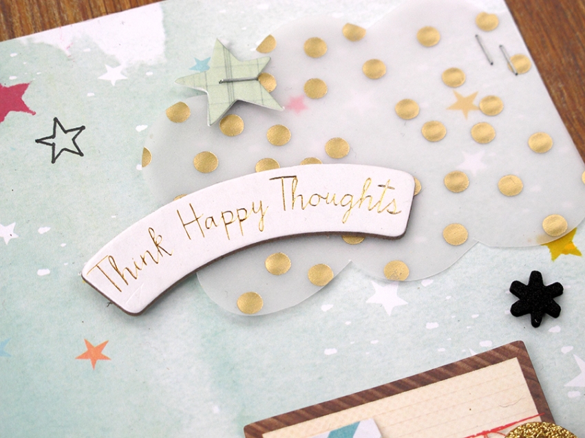
 The gold dot vellum from Studio Calico, made the most perfect clouds, which I attached with staples & lifted with pop dots. Chipboard sentiments, die-cut stars & stickers took them to the next level! Together with the starry paper, they made the cutest sky-scape.
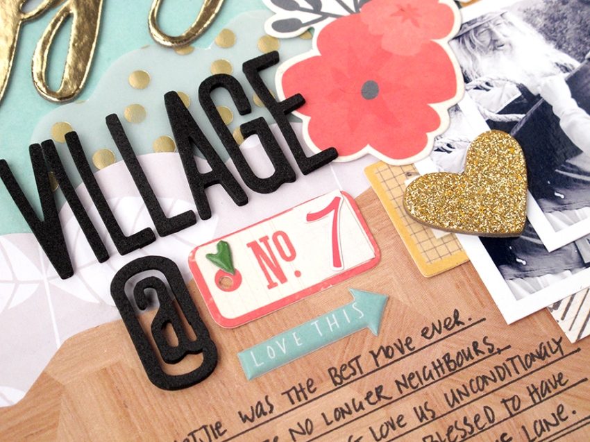 Next came the layered title…a combination of foam alpha stickers , die-cuts from Craft Paper & puffy stickers. The mixture of elements is interesting and creates a great cluster left of my photo strips.
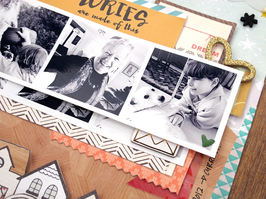 The photo strip has loads of dimension. I doubled the strip & layered with die-cuts, a journal card, chipboard elements & patterned paper creating a cluster that holds loads of visual appeal.
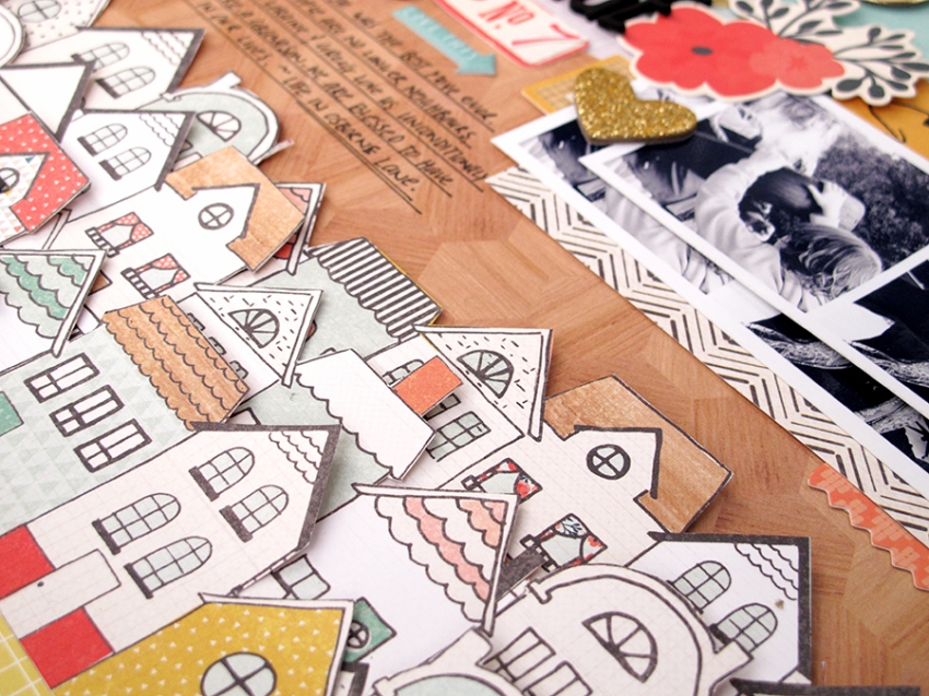 Next I positioned the fussy cut houses, attaching only the bottom edges of the strips, curling the roofs up a little to create height.
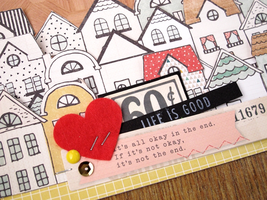 Lastly I added a little cluster on the bottom right hand side of the page. The red heart & black paper strip adding the last of my color pops, balancing out the visual triangles within the design. I am thrilled with this page. Not only does it hold a ton of sentiment for me but I am so happy with the final design. I hope you have found this page inspiring? Remember we have a social forum if you would like to share your Hip Kits work. They are a wonderful supportive & chatty FB group of crafters…come & join us: HERE>>
Watch my 'After Process' vid here:

No comments:
Post a Comment
Th♥nks for your comments!