So tell me…what is the color of your mood today?
I love the psychology of Color. Like birth and taxes, there is no escaping color. It is ubiquitous. Yet what does it all mean? Why are people more relaxed in green rooms? Why do weightlifters do their best in blue gyms? There is something so mysterious about the way color tells a story without words. Why does a sunflower put a smile on your face?
So when deciding on my page today…I decided I’d use YELLOW/ORANGE with GREEN ACCENTS but what does it all mean?
YELLOW
Cheerful sunny yellow is an attention getter. While it is considered an optimistic color, people lose their tempers more often in yellow rooms (hahaha…no wonder my headmaster was always grumpy), and babies will cry more if surrounded by yellow. It is the most difficult color for the eye to take in, so it can be overpowering if overused. Yet…yellow enhances concentration, hence its use for legal pads. It also speeds metabolism…seriously…? Well then, yellow yoga togs for me for sure LOL!
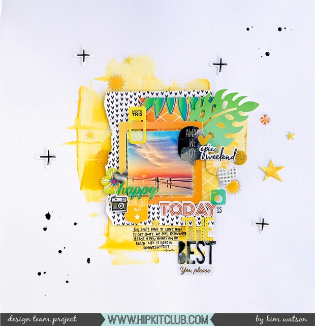
Today Was the Best by Kim Watson

The dominant emotion I feel when I look at this page, remember the memory & look at my photo is ‘overwhelming happiness’!! I love our neighborhood, our beach, our sunsets, the peace in our home, the love we all share for each other. This page reminds me that yes, life is tough…but it is also good in so many ways. Pages like these are always good to have in your albums because they cause you to pause & be grateful.

Using the AMAZING July 2017 Hip Kits made limiting my palette so easy. The kits are always so well thought out & even though they are built from elements from a variety of manufacturers, they coordinate, compliment & combine so well.

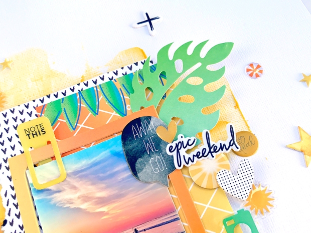
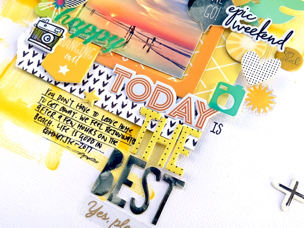
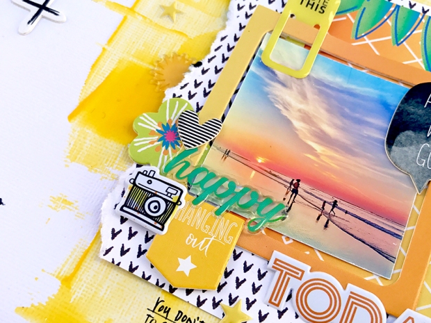
Starting with bold swashes of Yellow Pasteez from Shimmerz Paints, I created my fun background. The exclusive chipboard I designed, found in the July 2017 embellishment kit has a mixture of frames, sentiments, shapes & tags which once combined with our exclusive puffy stickers, PL cards & patterned paper…create the most fun layered vibe.

Adding the secondary colors green/teal brings a hint of coolness to the palette, which is just what one needs on layouts about sizzling summer days. Also the addition of graphic black & white patterns & accents brings contrast in the way of anchor points which can be so necessary when designing with a very tonal color palette.

So I encourage you to grab a bunch of coordinating elements…layer them, pile them together into clusters, and scatter them across your page to create something similar to mine. I hope you have found this interesting? Remember if you join my ‘Color Yellow Challenge’, be sure to tag me in the Member Forum, I’d love to see your works of art.
Thanks for the opportunity to inspire today!
Chat soon ~Kim

No comments:
Post a Comment
Th♥nks for your comments!