Showing posts with label Layout. Show all posts

Sunday, August 13, 2017

Use color to scrapbook your mood?

So tell me…what is the color of your mood today?
I love the psychology of Color. Like birth and taxes, there is no escaping color. It is ubiquitous. Yet what does it all mean? Why are people more relaxed in green rooms? Why do weightlifters do their best in blue gyms? There is something so mysterious about the way color tells a story without words. Why does a sunflower put a smile on your face?
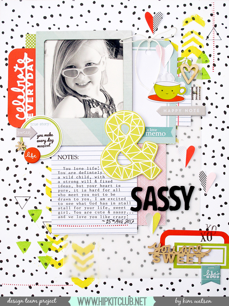
So when deciding on my page today…I decided I’d use YELLOW/ORANGE with GREEN ACCENTS but what does it all mean?

YELLOW

Cheerful sunny yellow is an attention getter. While it is considered an optimistic color, people lose their tempers more often in yellow rooms (hahaha…no wonder my headmaster was always grumpy), and babies will cry more if surrounded by yellow. It is the most difficult color for the eye to take in, so it can be overpowering if overused. Yet…yellow enhances concentration, hence its use for legal pads. It also speeds metabolism…seriously…? Well then, yellow yoga togs for me for sure LOL!
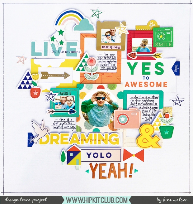
Today Was the Best by Kim Watson
KimWatson_TodayWasTheBest_HKC01
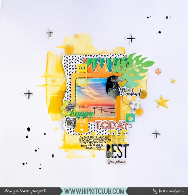
The dominant emotion I feel when I look at this page, remember the memory & look at my photo is ‘overwhelming happiness’!! I love our neighborhood, our beach, our sunsets, the peace in our home, the love we all share for each other. This page reminds me that yes, life is tough…but it is also good in so many ways. Pages like these are always good to have in your albums because they cause you to pause & be grateful.
KimWatson_TodayWasTheBest_HKC02
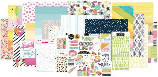
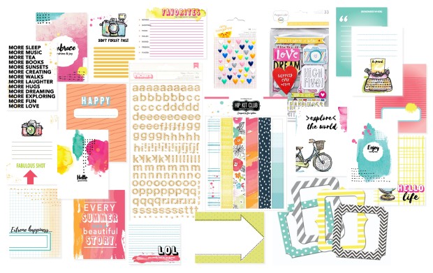
Using the AMAZING July 2017 Hip Kits made limiting my palette so easy. The kits are always so well thought out & even though they are built from elements from a variety of manufacturers, they coordinate, compliment & combine so well.
KimWatson_TodayWasTheBest_HKC03
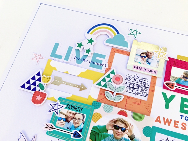
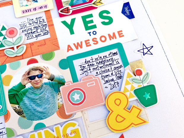
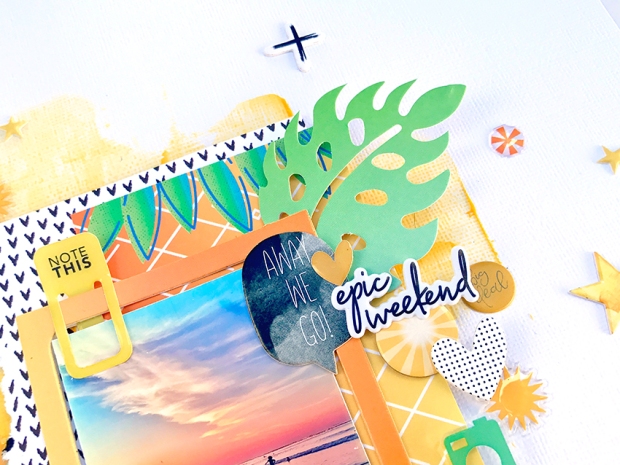
Starting with bold swashes of Yellow Pasteez from Shimmerz Paints, I created my fun background. The exclusive chipboard I designed, found in the July 2017 embellishment kit has a mixture of frames, sentiments, shapes & tags which once combined with our exclusive puffy stickers, PL cards & patterned paper…create the most fun layered vibe.
KimWatson_TodayWasTheBest_HKC04
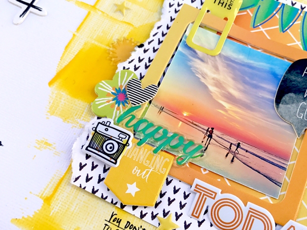
Adding the secondary colors green/teal brings a hint of coolness to the palette, which is just what one needs on layouts about sizzling summer days. Also the addition of graphic black & white patterns & accents brings contrast in the way of anchor points which can be so necessary when designing with a very tonal color palette.
KimWatson_TodayWasTheBest_HKC05
So I encourage you to grab a bunch of coordinating elements…layer them, pile them together into clusters, and scatter them across your page to create something similar to mine. I hope you have found this interesting? Remember if you join my ‘Color Yellow Challenge’be sure to tag me in the Member Forum, I’d love to see your works of art.
Thanks for the opportunity to inspire today!
Chat soon ~Kim

Saturday, August 12, 2017

Frames? No problem!

Hello Kim here, with a new project based on today’s theme: FRAMES. ‘Frame’ ephemera & die cuts are a big part of most manufactures collections these days & often I end up with a few left over at the end of each month, so I thought today I would find a fun way to use up a whole bunch on one page.
This page YOLO Yeah! was so much fun to put together (I admit I had to look up what YOLO meant haha!)…I mean what’s not to love about the Pink Fresh Studio, Dream on products & Vicki Boutin Frame die cuts?? All found in the June 2017 Hip Kit Club kits!
YOLO Yeah! by Kim Watson
KimWatson_YOLO Yeah!_HKC01
Ok…so the frames were the focal point of this page. I opted for a mixture of types & sizes…creating great layered interest. Some were filled with photos others embellishments. This allows the eye to travel around the page stopping on points of interest.
KimWatson_YOLO Yeah!_HKC02
Inspired by the great inspirational quotes included in the Pink Fresh Studio bits…I used them as not only points to mull over but also journaling. Keeping them in clusters, at three points within the design, muted their business. A design trick to note is, by ensuring they touch other elements, creates a feeling of association.
KimWatson_YOLO Yeah!_HKC03
Throughout the design, you will notice I used repetition for better unity within the page.
There are things that can be successfully repeated:
  • Colors
  • Shapes
  • Sizes
  • Groupings
  • Textures
KimWatson_YOLO Yeah!_HKC04
Adding height to the different frames with foam adhesive creates shadows and overall interest; this dimension helps one differentiate between the various photos. The photo below clearly shows you what I mean.
KimWatson_YOLO Yeah!_HKC05
So I urge you to decide on a color palette, grab a variety of frames with different patterns within that palette & play. Fill some with photos, others embellishments & others journaling. The symmetry they bring, help inject order into a busy accent heavy page with great results!
I am glad you stopped by! Thank you!
Chat again next time! ~Kim

Friday, July 21, 2017

Scrapbook SUMMER~ Inspiration!


The April kits from Hip Kit Club were so inspiring & had all the elements needed to capture the start of a gorgeous summer!! 

Love this Place by Kim Watson


Happy Weekend by Kim Watson


https://youtu.be/sVU0C8Q-Ahc

Find Peace & Sunshine by Kim Watson 


https://youtu.be/p3vo7VcNBDQ 

Sea, Sun & Soul by Kim Watson


https://youtu.be/_TG0EM3xUAc

The Best Beach Day by Kim Watson


There are a few April kits still available...do yourself a favor & grab one whilst you can!

BONUS!


Wednesday, April 12, 2017

Fill an Easter egg with 'confetti' & a FREE cut file

With Easter days away, I wanted to share a page I created with Easter photos from a few years back using my collection, Joy Parade, for Fancy Pants Designs.

I adore the pretty colors & adorable embellishments and the fact that this collection can be reworked for any occasion. 

Enjoy Easter by Kim Watson


 I really wanted to make a shaker egg embellishment but didn't want the hassle of actually filling it with loose toppers, so opted for a cute faux 'confetti' filled egg instead, using some of the fabulous puffy sticker dots & shapes from this collection. I adore how it turned out. 

Faux shaker egg accent by Kim Watson


A close up of the super cool sticker accents & alphas in this collection
The addition of cork brings great texture & contrast. 

:BONUS:

For a FREE cut file for you to create an egg shaker for yourself.


Tuesday, August 30, 2016

I designed it, now get to play with it.

What an honor to get an opportunity to design this awesome collection, ‘The Happy Life’ for Hip Kit Club July 2016 kits, now I get to play with those products...it is kinda a rush! LOL


Explore Madeira by Kim Watson


Memories by Kim Watson


It Doesn't get any Better than This by Kim Watson


Summer Play by Kim Watson


I adore patterns & mixing them, these pages are evidence of that. If you are looking for more pretty patterns & products to play with every month, then I urge you to consider signing up for Hip Kit Club kits!

Thanks for stopping by!!


Tuesday, June 21, 2016

Getting creative with graphic style products!

I am so excited to be guest designing for Bella Blvd again, I will always be a fan of their colorful graphic style.
KimWatson+Never Slow Down+BB01
"Never Slow Down", by Kim Watson.
Having received mostly boy collections meant I had an opportinity to scrap some photos of my son I had been hording like this one. Those cute car illustrations from the Let’s Go collection really stood out to me as the perfect boy themed page accent. Aren’t they adorable?! Together with the cute speed limit card, they totally inspired the color palette & theme behind the page.
KimWatson+Never Slow Down+BB02
The little cluster in the top right corner comprises of a piece of the Let’s Go sticker strip, a few ephemera pieces, a hand cut cloud & a conversational title using the Homespun Alpha Stickers. Machine stitching is always a great way to attach things to your scrapbook page as well as adding fabulous interest.
KimWatson+Never Slow Down+BB03
I love how the punchy black & big title on the card acts as a gorgeous focal point drawing attention to the photo. Chipboard, Stickers & cute themed e[phemera bring this page together nicely.
KimWatson+Love Yoy Little Boy+04
"Love You Little Boy", by Kim Watson.
Isn’t this sweet soft collection just adorable? It was perfect to scrap these photos of little Cassidy giving her baby brother cuddles. In love the blue with hints of caramel, grey & yellow…I naturally reached for the cute cloud paper first. Actually it was this paper with the doodled style clouds that influenced my cut-out cloud shapes.
KimWatson+Love Yoy Little Boy+05
Slipped under the photos, the clouds cut-outs layered with cloud ephemera & chipboard, made the perfect base for the sweet title.
KimWatson+Love Yoy Little Boy+06
Layering tags, chipboard & stickers from the Cute Baby Boy collection really helped tell my story. Again the limited color palette & dominance of white, makes for lovely, soft page that makes one say …aaawww.
KimWatson+Let's Go Explore+07
"Let's Go Explore", by Kim Watson.
Totally inspired by the chipboard & cardstock clouds (again LOL), I messed with mixed media & created a skyscape.
KimWatson+Let's Go Explore+08
The Hip Kit Club stencil & some Shimmerzpaint products, teamed with hand cut paper clouds & a mixture of other ephemera had the little aeroplane flying through a bright painted sky.
KimWatson+Let's Go Explore+09
A combination of Tiny Text & Homespun alpha stickers created amazing focal anchors within the page design.
KimWatson+Let's Go Explore+010
I think what makes this page extra special is the subtle layering of colors, textures & materials. Bella Blvd is so good at co-ordinating many different items across all their collections, meaning you can always find exactly what you need to make your next papercraft project interesting & fun.
KimWatson+Let's Go Explore+011
So thank you so very much to Bella Blv & their team for inviting me over guest. I really enjoyed working with these cute collections. I hope you have been inspired by my ideas. Have a wonderful crafty day further. Until next time.
Kim sig

Monday, September 07, 2015

Let's Party: on a budget!

Celebrating birthdays is an important thing in our home. It doesn’t necessarily means large expense…but definitely means big effort is put into making everyone feel hugely special. I decided to use that principle when creating this page about our daughters 11th birthday. 
I set about designing a page full of interest without fancy cutting machines, or I just used regular scrapbooking supplies from the super fun SUMMER SUN collection from Fancy Pants Designs to do it. Take a look at how I did it.
Celebrate 11yrs by Kim Watson
@fancypantsdsgns @KimWatson #summersun #birthdaycrafting #scrapbooking
Using plain colored paper as the background gave my page a strong grounding, especially with the variety of different patterns used to make my birthday-themed, hand-made page accents.
@fancypantsdsgns @KimWatson #summersun #birthdaycrafting #scrapbooking
Let’s start with the balloons:
  1. Select x4 different papers.
  2. Hand cut them into balloon shapes, they don’t have to be works of art :) Anything similar will work just fine, as they are layered into a grouping.
  3. Cut a little white crescent shape for the hi-lights.
  4. Tie a length of twine onto the bottom of each balloon.
  5. Layer into a group using pop dots & tie the strings together at the  bottom.
  6. Add a little paper bow to cover the know & hide the adhesive.
@fancypantsdsgns @KimWatson #summersun #birthdaycrafting #scrapbooking
Now the little party hats:
  1. Cut x2 striped triangle shapes.
  2. Using a scalloped edge punch, make some little decorative strips as trim for the bottom of the hats.
  3. Use a few shapes from the ephemera pack to decorate.
  4. Adhere to the page using pop dots for dimension.
@fancypantsdsgns @KimWatson #summersun #birthdaycrafting #scrapbooking
And lastly the little birthday cake:
  1. Taking a few patterned paper scraps, cut x3 layers for the cake.
  2. Add some white scallops to emulate frosting.
  3. Attach to the tag & add stickers numerals.
  4. Using pop dots, adhere to the page, push dressmaking pins into the foam dots underneath, acting as candles.
Now that your accents are all made, assemble your page. A few scattered sequins add festive sparkle…and don’t forget some journaling & stitching to finish. I am so pleased with the result & even more pleased that even when creating a page on a budget, it doesn’t have to end up looking plain. I hope you have found this post inspiring!
Fancy pants Designs collections used: Summer SunOffice Suite

Wednesday, August 19, 2015

Scrapping with layers + yellow alert!

I hope where ever you find yourself, that you are having the BEST time?! Here are some of my projects using the May Hip kit & add-ons. I am really enjoying the vibrant patterned papers & embellishment combinations!!
This week I thought I’d focus on the gorgeous Pink Paislee goodies from the #citrusbliss collection included in the kits.
Life is Sweet by Kim Watson 
@HipKitClub @KimWatson @pinkpaislee #ppcitrusbliss #scrapbooking #12x12 #layout  @shopEvalicious
These photos are from a few years back, I find scrapbooking older photos as well as current ones, refreshing & keeps my albums fresh & interesting.
@HipKitClub @KimWatson @pinkpaislee #ppcitrusbliss #scrapbooking #12x12 #layout  @shopEvaliciousIt was the citrus slices paper that sparked the idea of using circles in this design, which in turn sparked the idea of using some of the citrus cut-outs to make flowers. They add great 3D interest to my circle clusters.
@HipKitClub @KimWatson @pinkpaislee #ppcitrusbliss #scrapbooking #12x12 #layout  @shopEvaliciousThe cute stamp set from the May Color Kit & stencil…were a fantastic way to add subtle texture to my page. I layered the stamped images in soft colors around the page making sure to keep them understated, not to distract attention away from the focal areas.
@HipKitClub @KimWatson @pinkpaislee #ppcitrusbliss #scrapbooking #12x12 #layout  @shopEvalicious
As usual Evalicious’s wood veneer sentiments are adorable & fabulous on any page. For added color accent, I painted ‘Life is Sweet’ with lime green & magenta with stunning results. It really draws attention of the page. 
For this page, wanted a more graphic feel page with pops of bright colors on a neutral black & white spotted background!
Sweet & Sassy by Kim Watson
@HipKitClub @KimWatson @americancrafts @shopEvalicious @chickaniddy #scrapbookingkit #summercraft #layout #papercraft
I am so thrilled with how this page turned out. I am generally nervous about mixed media, not wanting to mess my page up with my clumsy attempts at adding paint & ink but this time it actually worked. I think the smaller stencils in the Color Kit teamed with daubers is what did the trick & I love how the mixed media looked under the vellum layer.
@HipKitClub @KimWatson @americancrafts @shopEvalicious @chickaniddy #scrapbookingkit #summercraft #layout #papercraft Making the most of the May Color Kit & stencils…I started by adding painted texture to my page, layering the stencils using the yellow & green paint daubers, I added both solid colors & doodled outlines.
@HipKitClub @KimWatson @americancrafts @shopEvalicious @chickaniddy #scrapbookingkit #summercraft #layout #papercraft
I then created interesting, layered clusters around the page. Trimming down the red Evalicious journal card made a fabulous sentiment tag. As did her cute puffy stickers layered onto a circle label with a tiny stamped sentiment. The stamp set which has loads of very small sentiments & accents words comes in the May Color Kit too. I am finding them perfect for a reluctant stamper like myself. They add super texture & interest to the page
@HipKitClub @KimWatson @americancrafts @shopEvalicious @chickaniddy #scrapbookingkit #summercraft #layout #papercraft The rest of the journal card became a label, layered with green one, a wood veneer accent & stamped images,  I created a pretty cluster in the bottom right corner too.
@HipKitClub @KimWatson @americancrafts @shopEvalicious @chickaniddy #scrapbookingkit #summercraft #layout #papercraft Using my trusty typewriter, I journaled onto a piece of  trimmed Chickaniddy paper, stamped with a few images to make it more interesting.
Yet more evidence of an amazingly well planned & thought out kit from Hip Kits. The perfect mixture of patterned papers, accents & embellishments, make designing scrapbook pages a breeze. Make sure to secure your June kits, & July kits. they are almost sold out.
Glad you stopped by!!