
Happy Monday everyone! I hope you are feeling like a little early week inspiration to get you in the crafty mood? Today I am going to show you how to limit your color palette with great results.
My page today used the ever versatile February 2017 kits…who would have known bits from this kit could be coordinated to create this gorgeous palette:
TEAL, LIME & YELLOW
Together by Kim Watson
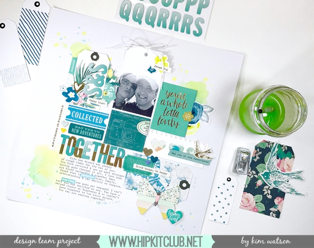
Having pulled out a selection of ephemera by Crate Paper & Little Pink Studio and a vague idea of the type of page layout design I wanted to try, I added watercolor splatters in three areas around the page, creating the perfect canvas on which to layer the other elements. My color choices were inspired by Claudia’s tags & painted flower die cuts, pulling out the teal, lime & acid yellow.
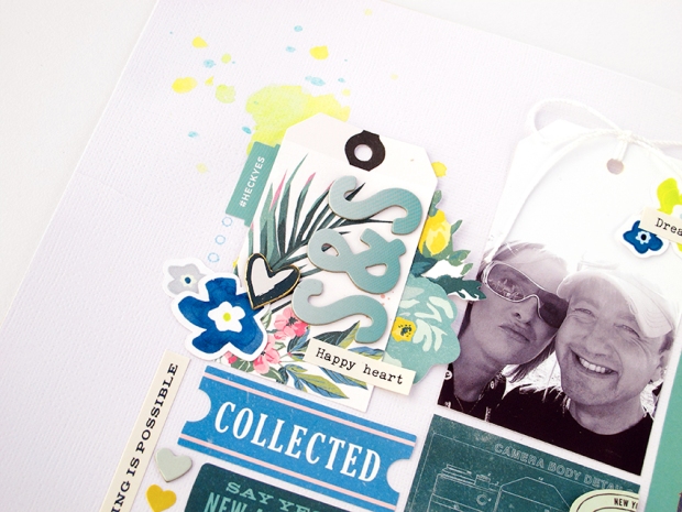
Initially I was worried that the pink on the tropical tag would mess with my palette, so covered a few of the pink flowers with blue die cuts. As I progressed with the page I realised a few hints of pink here & there actually added warmth & didn’t distract at all. Don’t you love how the scattered pops of gold & yellow give the page life?
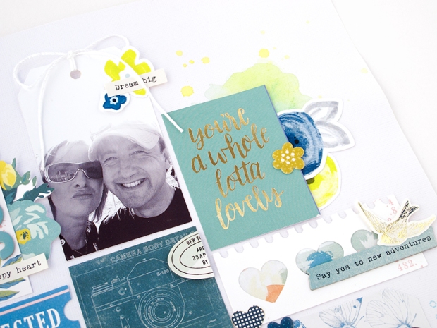
The photo, cut into a 2,5″ x3,5″ tag shape, really reinforces my grid design. The straight edges & tweaked width, helps with the overall symmetry and the twine bow adds subtle texture to the top of the page. Following the naturally forming lines, I built my grid design, filling extra spaces with smaller elements. It is a fun way to use up left over embellishments without cluttering the page.
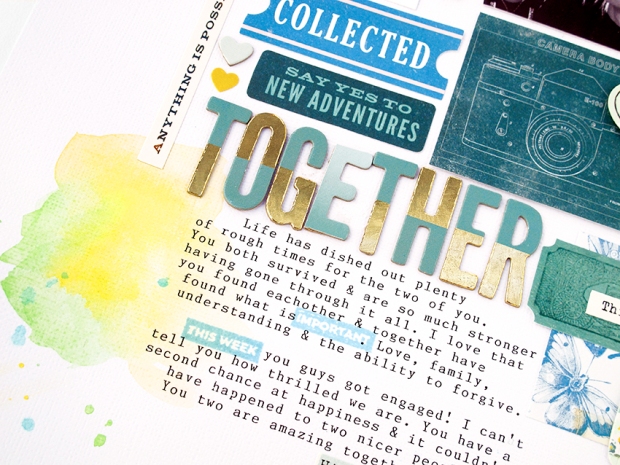
As you have probably noticed, I lost my second ‘E’, in the title: ‘Together’ haha! The funny thing is I only noticed it whilst editing my process video, which meant I had to go back & MacGyver an ‘E’ with the space there was AND do it in such a way so it doesn’t look like an obvious mistake. Every time I look at it I can’t help but laugh…it is really a case of not being able to ‘see the wood for the trees’ LOL!!
Anyway..I also wanted to mention a fun way to jazz up your journaling. I bought the February 2017 PL kit, included was the cutest stamp & notelet set from Paige Evans Oh My Heart. I used some of those little stamp prompts within the body of my journaling. Fun idea hey? It not only adds color, but emphasis to important parts of the text too.
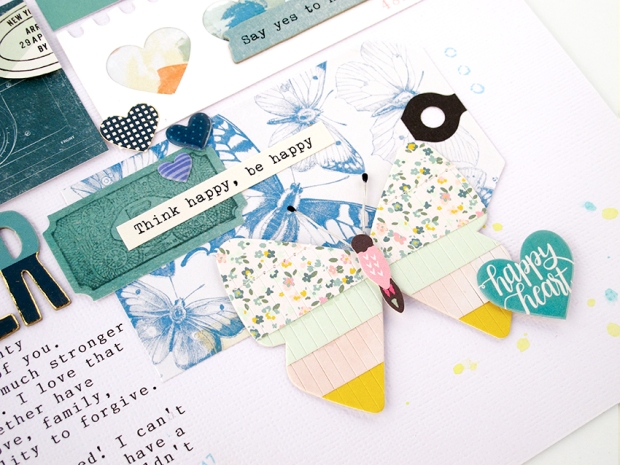
Lastly, I added a gorgeous butterfly tag & embellished it with a fringed butterfly accent & ephemera from both Maggie Holmes & Paige Evans. The result is a sweet cluster of butterflies & hearts with an appropriate sentiment.
I really hope you have found this inspiring. Limiting your color palette can be a fun way to challenge your creative process. I look forward to seeing your pretty pages in our member gallery on FB. Be sure to let me know when you post them, so I can leave you some crafty love.
Have an awesome Monday peeps ~ Kim X

No comments:
Post a Comment
Th♥nks for your comments!