Sometimes do you find you look at your stash & think...ugh! I really don't have the right embellishment, right?!
I do that all the time.
Until that is I joined the Queen & Co Design Team.
I was forced to stop being lazy & think out of the box a little to create embellishments and accents, whilst making the most of their gorgeous products!
This card is the result of one of those light bulb moments!
All done…four rainbow inspired cards, sure to bring joy to anyone who receives them. I hope you have enjoyed them. If you are curious how I created the backgrounds, be sure to take a look at my Youtube channel.
Good morning friend...I hope you have a cuppa & are ready for some new inspiration?
For todays card I decided on a purple & lavender color scheme. Isn't it pretty?? The combination of purple papers from the Delightful Dots paper stack & lavender & lilac pretty bits from Queen & Co, make crafting handmade cards so worth it.
A watercolor wash on the base card grounds things nicely, on top of which I placed the flower shaker. I selected a variety of purple colored, coordinating items, then filled the shaker & decorated the card. The beauty of Queen & Co products is that as different they are all, they work so well with each other to create the most gorgeous beautiful projects!
The result is a fancy, sophisticated card with loads of bling appeal.
Kim Watson here today with a card created using the uber cute Foam Flower Shaker kit. I did something a little different with this set...instead of the traditional topper filled shaker...I filled it with flowers & diamonds. Hello, tell me that isn't the best combination for a special friend in your life??
For this card, I created loose shaker box with clear windows both sides. Before closing the underside I filled the shaker with sparkly diamond toppers giving the card gorgeous sparkle & shine. A variety of mixed media techniques on the base card using texture paste, gesso, ink, gold paint & stencils creates the perfect canvas for my trendy flower shaker.
I took a mixture of NEWPom flowers, separated the layers and clustered them flat underneath the shaker. The cluster creates a little multi-colored mat and a GORGEOUS focal point. Gold yellow, Petite Posies scattered around, add subtle bling & texture.
Oh my crafty heart…don’t you just LOVE these colors?
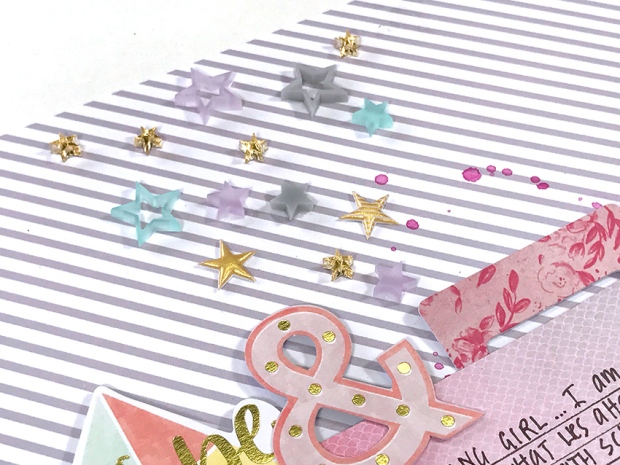
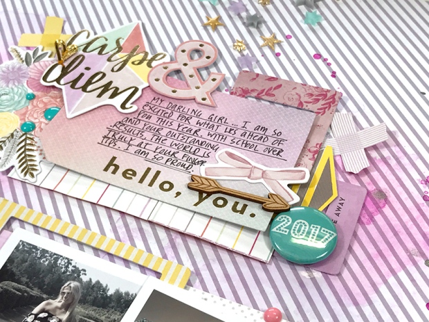
The December Hip Kitsare to-die-for! The wait was well worth it! Paige Evan’s collection, Take Me Away for Pink Paislee, is pretty, artsy & so easy to scrap with. Take a look at what I did.
Using an exclusive paper by Kimberly Hutchinson, I applied layers of misty fuschia inks from Shimmerz, building up intensity as I went along. Bold splatters finished off things nicely giving a super pop of color!
Aren’t those exclusive resin stars darlin’? They were calling to be scattered across the page somewhere…just like the dreams & possibilities that lie ahead for the girls, as they make big decisions about careers & what to study at uni.
Pretty layers using ‘Take Me Away’ papers & ephemera. The Hip Kit exclusives add lovely texture & interest.
I used the gorgeous MME mirrored acrylic die cut numbers to attach the cute tassel, allowing it to dangle free.
I adore how the mix of MME mirrored acrylic die cut & charcoal glitter thickers, layered on top of a floral ephemera piece make the most gorgeous title. It is pretty & sophisticated with a touch of whimsy.
Process Video of Hello Life by Kim Watson
The December Hip Kits are totally fabulous…if you haven’t grabbed one for yourself, I suggest you do. Treat yourself whilst there are a few left to buy.
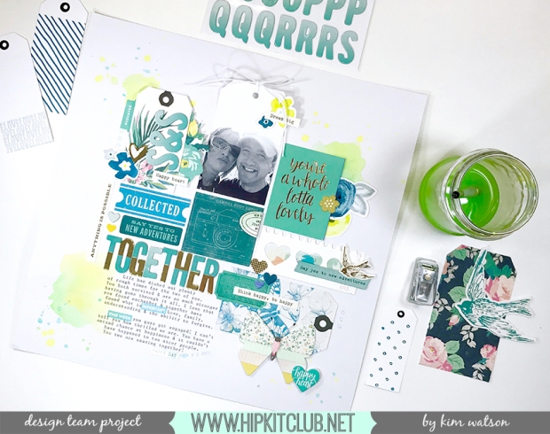
Happy Monday everyone! I hope you are feeling like a little early week inspiration to get you in the crafty mood? Today I am going to show you how to limit your color palette with great results.
My page today used the ever versatile February 2017 kits…who would have known bits from this kit could be coordinated to create this gorgeous palette:
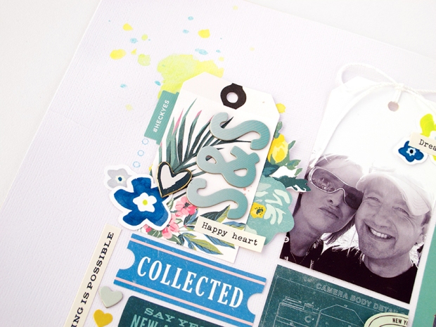
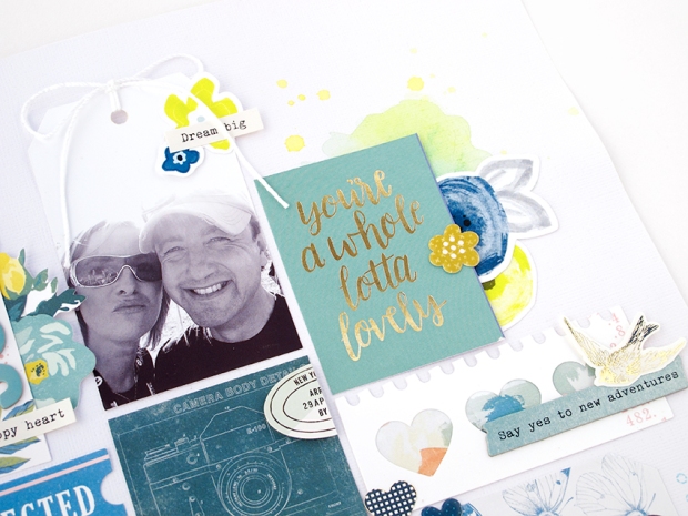
Having pulled out a selection of ephemera by Crate Paper & Little Pink Studio and a vague idea of the type of page layout design I wanted to try, I added watercolor splatters in three areas around the page, creating the perfect canvas on which to layer the other elements. My color choices were inspired by Claudia’s tags & painted flower die cuts, pulling out the teal, lime & acid yellow.
Initially I was worried that the pink on the tropical tag would mess with my palette, so covered a few of the pink flowers with blue die cuts. As I progressed with the page I realised a few hints of pink here & there actually added warmth & didn’t distract at all. Don’t you love how the scattered pops of gold & yellow give the page life?
The photo, cut into a 2,5″ x3,5″ tag shape, really reinforces my grid design. The straight edges & tweaked width, helps with the overall symmetry and the twine bow adds subtle texture to the top of the page. Following the naturally forming lines, I built my grid design, fillingextra spaces with smaller elements. It is a fun way to use up left over embellishments without cluttering the page.
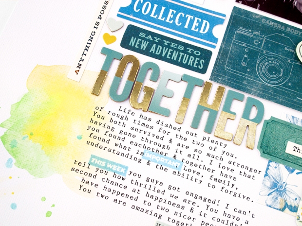
As you have probably noticed, I lost my second ‘E’, in the title: ‘Together’ haha! The funny thing is I only noticed it whilst editing my process video, which meant I had to go back & MacGyver an ‘E’ with the space there was AND do it in such a way so it doesn’t look like an obvious mistake. Every time I look at it I can’t help but laugh…it is really a case of not being able to ‘see the wood for the trees’ LOL!!
Anyway..I also wanted to mention a fun way to jazz up your journaling. I bought the February 2017 PL kit, included was the cutest stamp ¬elet set from Paige Evans Oh My Heart. I used some of those little stamp prompts within the body of my journaling. Fun idea hey? It not only adds color, but emphasis to important parts of the text too.
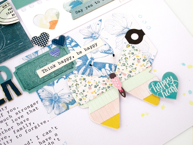
Lastly, I added a gorgeous butterfly tag & embellished it with a fringed butterfly accent & ephemera from both Maggie Holmes & Paige Evans. The result is a sweet cluster of butterflies & hearts with an appropriate sentiment.
I really hope you have found this inspiring. Limiting your color palette can be a fun way to challenge your creative process. I look forward to seeing your pretty pages in our member gallery on FB. Be sure to let me know when you post them, so I can leave you some crafty love.
Today I have a fun idea, the perfect card to cheer someone up. Again using the fabulous Foam Front cards from Queen & Co, I chose the Rainbow Die & Card Set. I did something a little different with this set too...I created x2 cards with the same dies but with x2 very different results.
For this card, I created a rainbow not only using the shaker sections, but also pieces in between, this gave me the correct amount of spaces for a proper x7 piece rainbow. For a little bit of fun & texture I filled the shaker windows with sweet little Pops, matching the colors of the paint underneath. The cloud shaker was filled with sparklydiamond toppers giving the clouds sparkly & shine.
To create the inky clouds scene, I used the cloud shaker paper cover as a mask & an ink pad. Shifting its position and varying the ink pressure, created areas of light & dark. The result...a pretty sky. A cute sun motif & sentiment from the Partly Cloudy Stamp Set from Lawn Fawn, & clear Twinkle Drops were exactly what I needed to complete the card.
Swapping the card cover piece with watercolor paper, I painted a blended rainbow & allowed it to dry. Using the die in the card set, I cut a new cover, then filled the rainbow shaker pieces with a combination of clear Diamond Toppers & clear Tiny Bubbles. The cloud on the other hand I filled with coordinating rainbowTiny Bubbles.
To really support the vibrant rainbow of color on this card, I took a mixture of NEW Pom-pom flowers, separated the layers and clustered them around the page; matching Pops were the perfect flower centers.
Lastly, I selected sequins that also matched the different colors of the paint on the cover. Keeping them self colored added subtle twinkle & texture. I couldn't have asked for a more appropriate sentiment, than the one I selected from Paper Smooches Stamps.
Voila! A pretty way to send someone colorful good wishes.
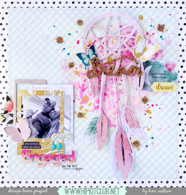
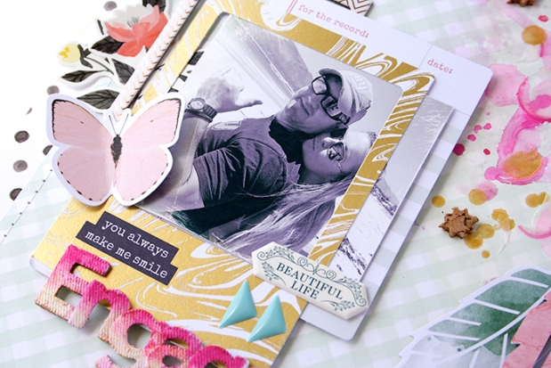
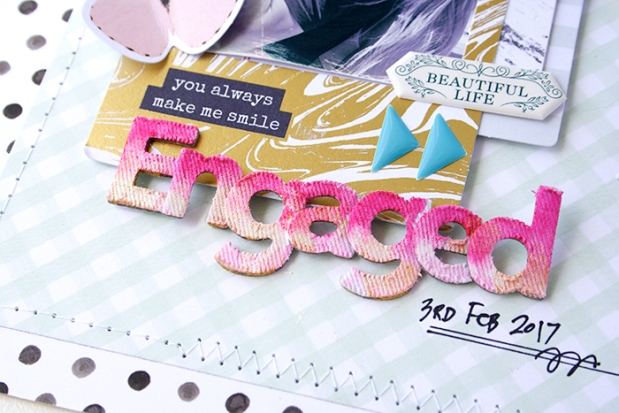
Hi friends…Kim here, with a new page using the January 2017 kits & one of the amazing free subscriber cut files designed by Jessica Fabiano, to commemorate my brother’s exciting engagement on 3rd February 2017. We are so looking forward to their up and coming wedding & I wanted to create a page that was super special. The mixture of cut files, and mixed media helped me achieve the perfect look.
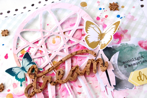
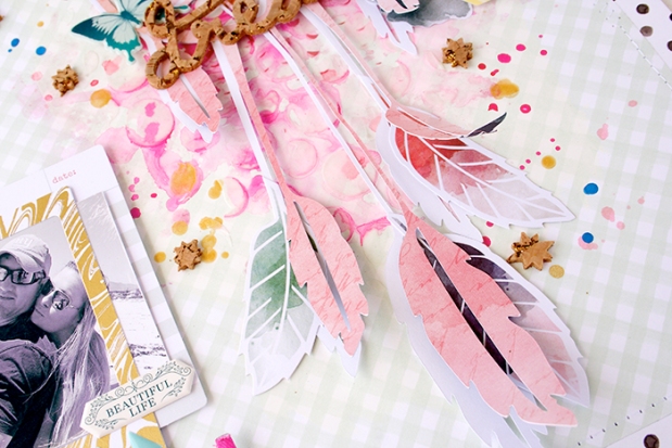
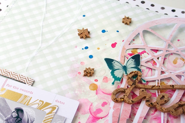
I had fun with the base page by creating a lovely collage of gesso, texture paste, Shimmerz, watercolor & gold mist. Then by cutting the dream catcher file in white cardstock, as well as patterned paper, I was able to create a 3D drop shadow effect. By attaching only the frame, I left the feathers loose further adding fantastic dimension.
Taking x3 feather ephemera from the Pink Paislee pack in the main kit, I slipped them in between the x2 cut file layers adding some pops of color. The cool thick cork adds, interest & contrast scattered around the page, balancing out the soft colors.
Layered frames & a notelet create an interesting cluster, decorated with puffy stickers & butterflies are the perfect detail for the bottom left side of the page.
Wanting a bright title, I got a little messy with the canvas alphas found in the January 2017 January kit. I covered my process in my technique video…but basically it is layers of gesso, x2 shades of pink paint & Heidi Swapp gold mist. The effect is fantastic!!
I really hope you liked my page & idea. I hope you are inspired to create a similar design with your January kits. Remember if you are looking for a great crafty community, be sure to join the HKC Facebook page and the HKC Member Forum.